~/ logo the village node

Four houses around
a rotated square. On purpose.

Internet Village: The Village Node

// four houses

Four houses. Four nodes.

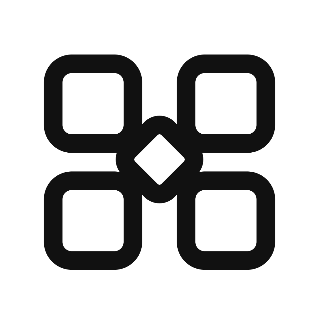
The four blocks around the centre are the village in Internet Village. They are drawn like small houses: human, local, and approachable. But they also read as network nodes: software, devices, services, and secure systems connected through the internet. That double meaning is intentional. The logo is warm enough to feel local, but precise enough to belong to software, IoT, security, and infrastructure.

// the four pillars

People, devices, software, security.

The four blocks also stand for the four worlds Internet Village brings together. They sit in fixed positions, and the positions are not accidental: the top half is what the work is for, the bottom half is how it gets made and kept running.

top-left · people

Origin, idea, human need.

Clients, users, teams, communities. The reason a system exists in the first place.

top-right · software

Software, interface, service.

Mobile apps, web apps, custom backends, APIs. The surface people actually touch.

bottom-left · devices

Hardware, sensors, embedded.

Raspberry Pi, NVIDIA Jetson, ESP32, STM32. The physical layer that meets the world.

bottom-right · security

Trust, hardening, reliability.

Secure development in Rust, reverse-engineering hardening, WebAssembly sandboxing. The work that keeps it standing.

Each block keeps its own identity. They share the diamond at the centre.

Internet Village connects independent systems around a trusted core.

// the diamond

A village square in the middle.

At the centre sits a single rotated square: the village square. It is the one piece of visual tension in an otherwise orthogonal grid, and it carries the meaning of the mark. A meeting point. A routing hub. The secure core.

Earlier sketches put a plain square at the centre. Clean, but generic. Rotating it forty-five degrees was the smallest change with the biggest payoff: the mark stopped looking like a network-grid icon and started looking like ours.

// monochrome first

Black on white. White on black. That's it.

The mark is built to work in a single colour. No tints, no bevels, no drop shadows, no gradients on the rectangles. It prints in one ink. It scales from a 16-pixel browser tab to a 4-metre tradeshow banner without losing its identity.

We do allow one colour accent on the site: a blue-to-violet gradient on the phrase "mobile solutions" in the hero. That is the exception. The logo itself stays monochrome.

// downloads

Grab the SVG.

Single canonical file at /logo.svg. 240×240 viewBox, black stroke (#111), white fills, no nested transforms. Re-colour by changing the stroke to your ink and the fills to your background.

// colophon

Designed in 2026. Set in Inter by Rasmus Andersson.